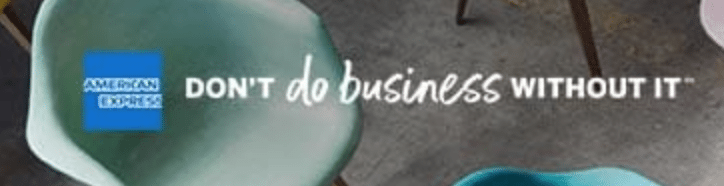
Amex released a slightly modified logo and numerous other branding tweaks as part of a new marketing platform. The most basic changes are a stronger blue in the American Express logo and a new tagline, ‘Don’t live life without it’ and ‘Don’t do business without it.’ (Press Release) These changes can be viewed on the American Express website.


Another interesting change (which I haven’t yet seen in the real world) is that the American Express will begin showing up as AMEX on small icons where the full text is hard to see. I personally think the way they did it is awful and weird, yet others think it’s a brilliant piece of design (shrugs):


They’ve also refined the centurion figure pictured on the center of some Amex cards:

It’s funny how the marketing company put the Amex Platinum card details onto the Blue Cash card marketing, let’s hope this shows up in real life 😉 :

The marketing work was done by the Pentagram design firm, you can read their detailing of the changes here.
It’s incredibly fascinating to read the dozens of comments to this Underconsideration blogpost which is apparently a blog dedicated to studying branding changes. Just shows how each niche has many people who find the nuances of that subject important and worth serious discussion, no different than we would discuss a minor change in card benefits and the like.
Hat tip to u/croqcall on Reddit