Probably the most common complaint about the Citi Prestige & Citi Premier cards is the fact that the magnetic strip is on the front of the card. Because cashiers are so used to the strip being on the back of the card, it often takes them multiple swipes to work out how to use it and even then you often have to explain it.
We speculated that Citi was planning to change this when they update their app with new card designs and it looks like Citi has finally realized that some people aren’t using their cards as much as they would otherwise because of this issue and have launched new card designs with the EMV chip and name on the front of the card and the magnetic strip on the back of the card. Here is a sample of what the new card designs look like:
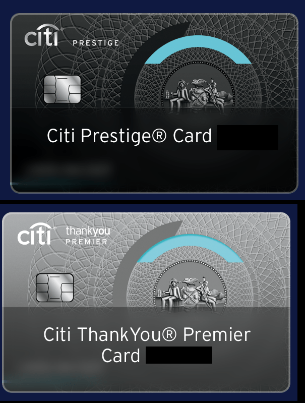
The new designs are officially launching on October 19th, but you should be able to request one now and get it expedited for free when it officially goes live.
The magnetic strip should remain in the front. I luv having the magnetic strip in the front and I like explaining where the magnetic strip is. I swipe a lot and it is not an issue having the strip in the front. People find it intriguing and like seeing something different. Citi did a great job in designing the original card with the strip on the front. Original, sets it apart from the other cards as it should because it is Prestige.
Just received my replacement thank you card today. It was sent out two weeks ago so it has the strip on the front, before this I has the old thank you design without the arch just simple and blue with the strip on the back. So looks like I’ll have the strip in the front for the next couple years. I think I’ll like the strip on the front since it will be a conversation starter. This would be great for the single guy trying to start up a conversation with a cute cashier.
Just wanted to confirm that the mag strip on the front is a great conversation starter with girls lol I have met a few this way including getting some numbers.
Had this for 3 months now. Its annoying since its backwards and confuses everyone. Waste of my time.
Called to get a replacement of the Premier (I always had the older design). Rep had no idea what I was talking about but said she would request a new one anyway and hope the new design gets sent.
Premier agent did not know either but she talked to her Manager and they advised that all new REPLACEMENT cards as of yesterday will have the new design — it is automatic.
I was then switched to a different department to handle the Prestige card and the agent there knew about the switch and said that there was a lot of call volume coming in asking for the switch.
I opted for regular delivery as I did not need the cards immediately.
DOC — GREAT POST! I NEVER WOULD HAVE LEARNED OF THIS WITHOUT YOUR INPUT!
I can’t use it in some parking vending machines, no matter which way I insert it. Couldn’t use it at airport parking at the booth, she tried all 4 combinations, can’t get metro fare cards with it. Maybe some machines’ logic is poor.
This shouldn’t be an issue with card readers that now read chips, but I’m still glad they changed it.
Just got a replacement Prestige card last week, noticed the card is now matte and a little cheaper looking. Not a big deal, still love the card, guess they are just already changing it for this magnetic strip swap.
Arguably having two styles in circulation will be even more confusing than just having the original out there.
Haha, I can imagine a cardholder getting frustrated because the cashier thought “oh I know this card, I’m swiping the front!”
Best points and miles news in a long time!
Yay! I love my Prestige card, but it drove me crazy when I was in Europe. The sales and restaurant people kept telling me the card didn’t work. Finally I figured it out, they were swiping it wrong.
Glad they are changing this back. Too crazy going against the way these cards’ magnetic stripes have been for almost ever.
I think the coolest thing about the card is that blue arch. I noticed one night when I had my phone flashlight on that the arch is see through .
I love how the circle is printed inside the card, giving it a tiny amount of depth. That Citi didn’t just print the logo on the top but figured out how to layer the card is awesome.