Amex Gives Us Back Revamped Amex Offer Interface

Wow, I was waiting for this one.

For as long as we remember, the Amex Offer interface in the login was a running list which was very easy to navigate.

My_American_Express_Account_Summary

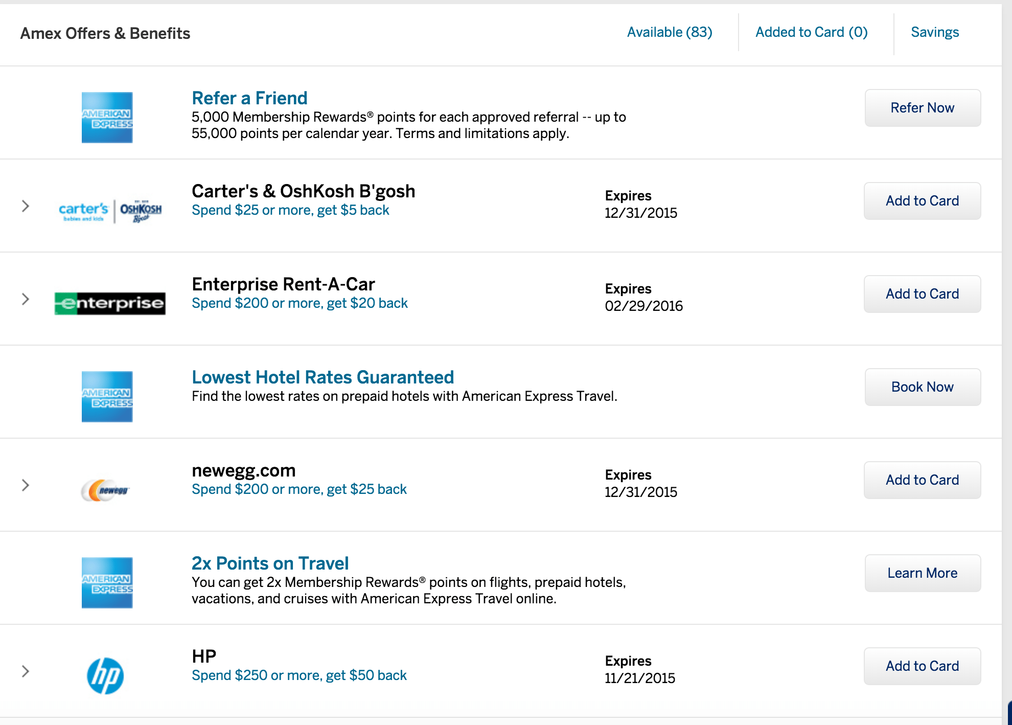
Recently, as part of a site redesign, Amex make the interface a sliding design which allowed us to see the new offers by clicking the arrow buttons. It may or may not have been more aesthetically pleasing, but it was definitely more annoying to navigate.This lead to suggestions such as using the mobile site instead or to using a special link which brings you back to the old design. (Incidentally, the link still works.)

Screen Shot 2015-11-05 at 12.54.06 AM

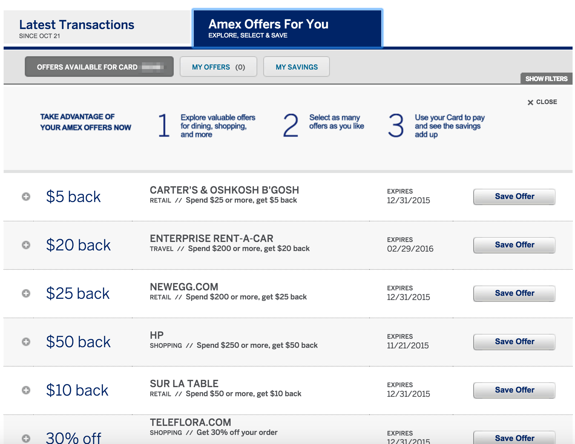
Luckily, it seems many people weren’t happy with the new design and we now have version #3 which is both aesthetically pleasing and easy to navigate. It’s very similar to the version #1, just with a new look and with a slightly different slide-down option when clicking to see the details.

Screen Shot 2015-11-05 at 12.43.54 AM

Finally!

Subscribe
Notify of
guest

12 Comments
newest
oldest most voted

mike
mike (@guest_404794)
May 11, 2017 00:28

I like the #2 interface, is there a was to access it like the #1 interface?

MH
MH (@guest_193951)
November 5, 2015 17:34

Displaying it like this is for 50% or more of card holders who didn’t/don’t know Amex offers even existed.

Vic
Vic (@guest_193887)
November 5, 2015 14:03

The side scrolling design was so bad that I suspect Amex did it intentionally to prevent users form using Amex offer.

The Value Traveler (@ValueTravelerOz)
November 5, 2015 13:04

We should tweet them to death and let them know to change it back.

Kent C
Kent C (@guest_193859)
November 5, 2015 12:28

My suggestion to Amex would be to allow filter/sort customization of the offers. This is only reasonable due to the large amount of offers on many cards. Ex, allow filter by type such as restaurant. Since you are logged in to see your offers, your settings could be saved. Example, we get tired of seeing the same offers over and over we do not want. Allow an ability to hide an offer or even remove it’s offering, save those settings to your specific login so next time you hit the site, you’re offers list isn’t so bloated. How bout sort by newest offer (they’re not always on top like many believe). I bet that would be a hit. C’mon Amex.

Kent C
Kent C (@guest_193854)
November 5, 2015 12:22

I bet a number of people in their tech, design, management depts had to review and approve the awful sliding interface.

Pretty bizarre how something like that passes through all those hoops only to be abandoned a short while later. This is a great case of if it ain’t broke don’t fix it.

Michael
Michael (@guest_193834)
November 5, 2015 10:49

Thanks for actually listening to customers AMEX!

Eric
Eric (@guest_193798)
November 5, 2015 08:51

Heh was wondering if other complained to Amex like I did. Yay

Lantean
Lantean (@guest_193817)
November 5, 2015 10:22

i did! and i also told them that as one of the reasons i was canceling one of my cards. the agent was perplexed… but i keep telling her the new design was so bad that i could sign up for any offers… hehe.

projectx
projectx (@guest_193794)
November 5, 2015 08:38

Hallelujah! That side scrolling interface was awful.

Glenn
Glenn (@guest_193730)
November 5, 2015 03:23

Yeah, just noticed that myself. As long as Ctrl-F works, I’m good.